Block properties
Select
Basic block property that allows you to choose from predefined options.
Overview
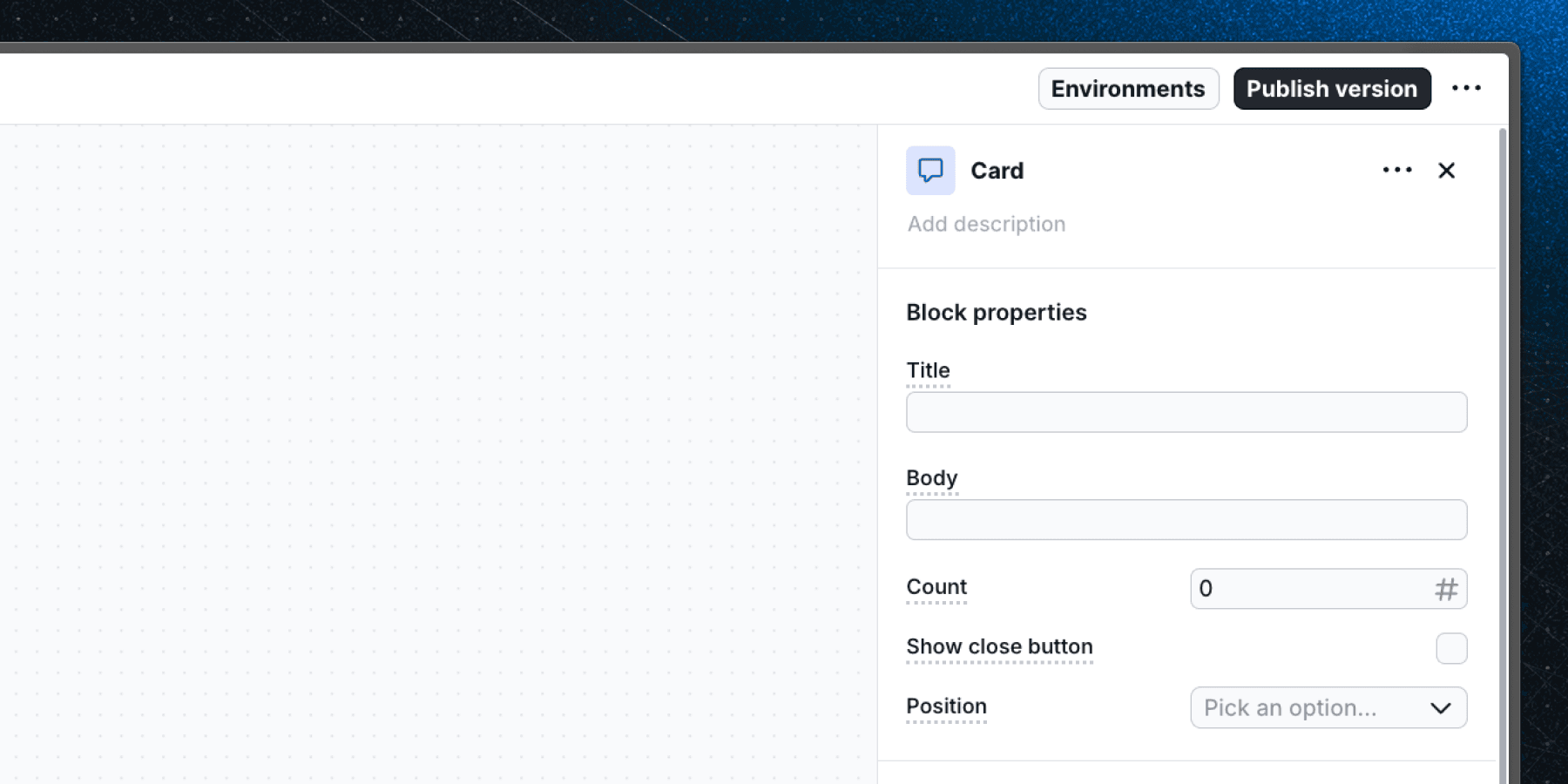
The Select property provides a dropdown menu for choosing from a predefined list of options. Use it when editors should pick from a fixed set of values rather than typing free text.
- Renders as a dropdown in the block editor.
- Supports single selection from a list of predefined options.
- Option values can only be strings.
- The default value is an empty string.
- Supports personalization — option values can include
{{ property_name }}syntax. - Supports localization — can be set independently per language group.
Common use cases
| Use case | Example |
|---|---|
| Layout or position | "Placement" — top, bottom, left, right |
| Size variant | "Size" — small, medium, large |
| Component style | "Theme" — light, dark, brand |
Defining options in a component
When creating a custom component, define select options as a union of string literals in your component props:
type Props = {
  placement: "top" | "bottom" | "left" | "right";
};
In the Flows dashboard, add matching string values to the select property's option list.
Last updated on