Examples library
Tour
Guide users along their journey through your product
Tour example application – Flows
Guide users through your product with interactive, in-app tours.
A product tour helps new and returning users discover what’s new, understand your product faster, and reach value sooner. With Flows, you can build fully customizable, multi-step tours that live inside your application (not on top of it). Each step can be rendered inline or as a floating component using pre-built UI elements or your own custom designs, so your guides feel native to your product.
Why product tours matter
Product tours are one of the most effective ways to improve user onboarding, feature discovery, and product adoption. They help users:
- Explore new or updated features confidently.
- Understand key workflows without leaving your app.
- Reach activation milestones faster.
- Stay engaged as your product evolves.
Unlike a typical product tour library, Flows gives you complete control over design and logic. You can embed custom UI components, define behavior with Flows, and let the SDK handle user states.
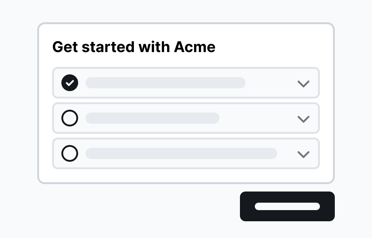
About this example
This product tour example shows a multi-step guided tour built with Flows. It introduces users to key product areas using a combination of modals and tooltips. The tour features:
- Welcome modal: Greets users and sets the context.
- Feature highlights: Floating tooltips guide users to important elements.
- Completion step: Confirms success and encourages next actions.
You can customize every part of this experience (copy, visuals, placement, and logic) while Flows manages the flow and state transitions for you.
When to use a Product Tour
Use a tour whenever you want to guide users through a defined journey, such as:
- Giving new users a guided app tour during their first session.
- Onboarding new users.
- Announcing new features or UI updates.
- Educating users on complex workflows.
- Re-engaging returning users after a redesign.
Best practices for effective Tours
A good product tour:
- Is concise and contextual. Keep steps focused on helping the user accomplish one goal.
- Matches your product’s tone and design. Use your existing UI style for familiarity.
- Guides, don’t interrupt. Provide helpful direction without taking over the experience.
- Adapts to user behavior. Don’t show steps users have already completed.
- Ends with clear next steps. Reinforce learning and encourage continued exploration.
With Flows, you can design tours that feel built-in, not bolted-on, ensuring they’re always relevant and delightful.
Workflow setup
When a user opens the application for the first time, they encounter a welcome modal, followed by a series of steps that showcase various features of Flows. Modal, Tooltip, and Hint components are built-in components from @flows/react-components, while the inline card component is custom-built and can be found in the custom-card.tsx file.
Below is a screenshot demonstrating the workflow configuration for this Tour example:

Getting started
- Sign up for Flows if you haven’t already. You can create a free account here.
- Clone the repository from GitHub and install the required dependencies in the project directory.
- Add your organization ID in the providers.tsx file.
- Create a new component in your organization with the following configuration:
- Component type: Tour component
- UI component: CustomCard
- Slottable: true
- Custom properties:
- Title
- Description
- Recreate the workflow in your organization and publish it.
- Run the development server with pnpm dev.
Learn more
To learn more about Flows take a look at the following resources:
This tour example demonstrates how quickly you can create a guided user onboarding flow with Flows. Feel free to explore more advanced configurations and styling to tailor the experience for your users.
Framework
Next.js
Tags
Explore more examples
Churn prevention flow
Reduce cancellations with a multi-step churn prevention flow.


Floating checklist
Interactive list of suggested setup actions the user can take. Floating in the corner of the screen.
Product Hunt launch announcement
Launching your product on Product Hunt? Broadcast the launch inside your app.


Build anything with Flows
Build the product adoption experiences you've always wanted.
No credit card required. Free forever.