Examples library
New feature badge
Highlight new features in your application with a badge.
New feature badge example application – Flows
A new feature badge is a lightweight UI element that draws attention to new or updated functionality directly in your app. This example shows how to build one using @flows/react and floating-ui.
Unlike modals or banners, the badge sits inline next to the feature itself - a subtle visual highlight that guides users to what's new without interrupting their workflow.
What is a new feature badge?
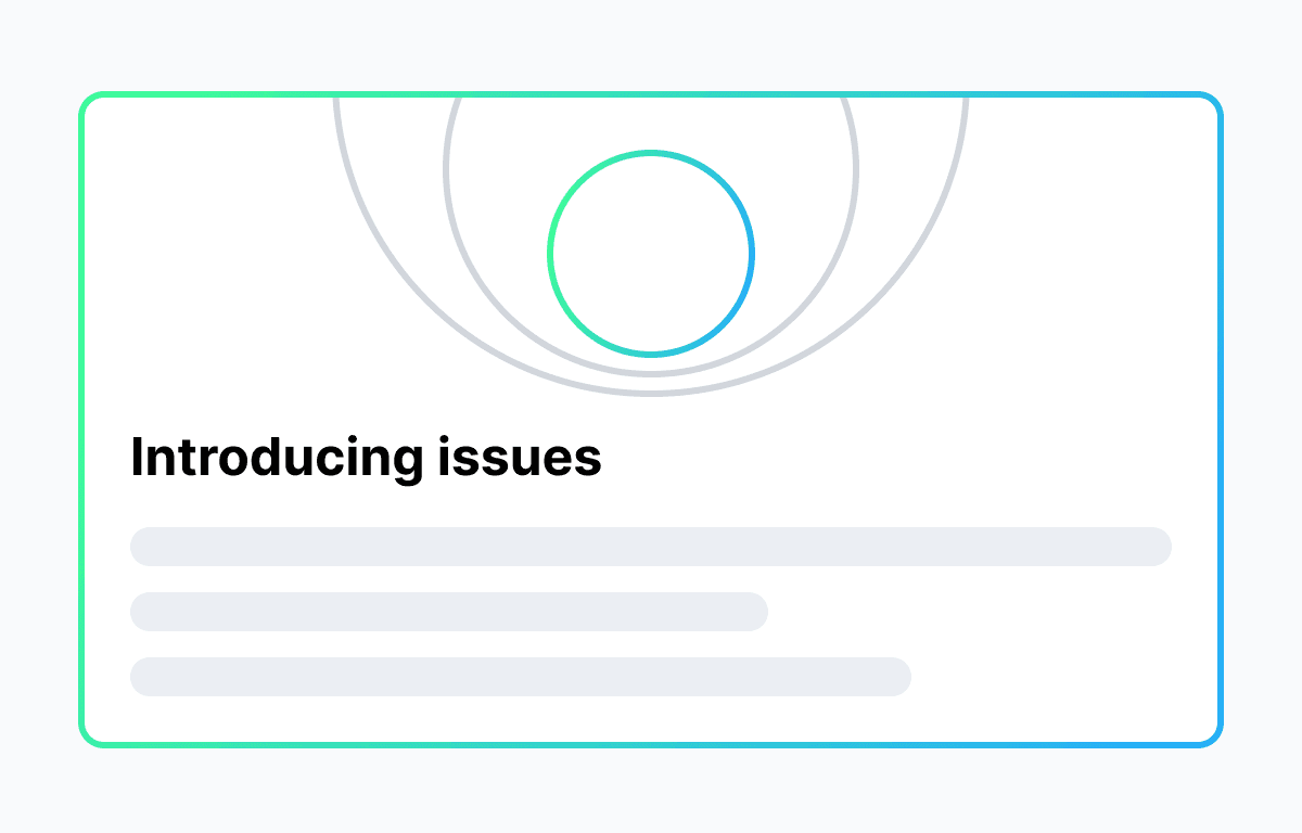
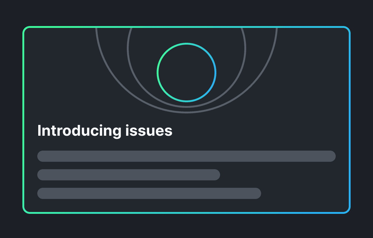
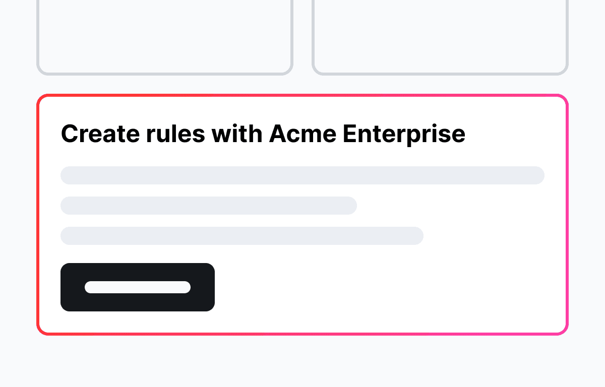
A new feature badge is a small indicator placed next to a navigation item, button, or menu entry to signal that something is new or recently updated. It's one of the most low-friction ways to drive feature discovery - users see it in context, at the right moment.
Common uses include:
- Marking a new sidebar link or navigation item
- Highlighting a newly added setting or preference
- Drawing attention to a new dashboard widget or report
New feature badge UI
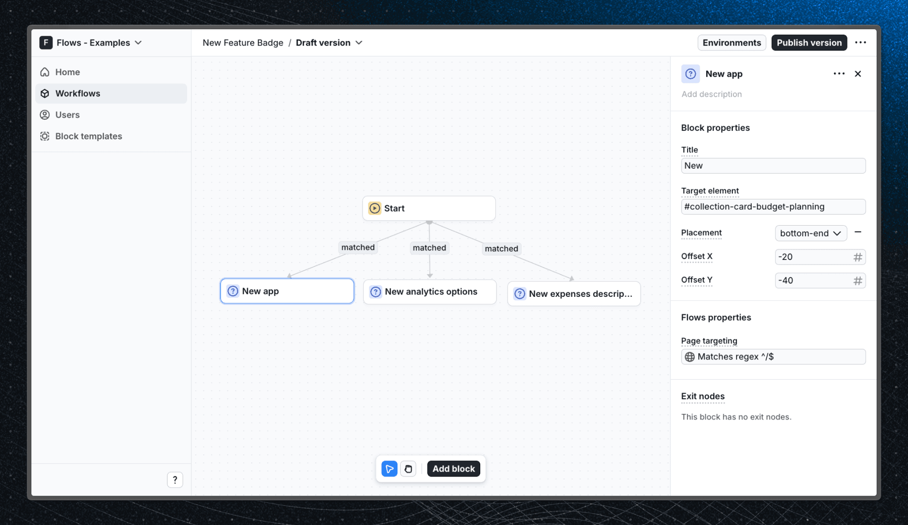
The badge in this example is a floating UI element powered by floating-ui, which handles positioning relative to any target element on the page. It can be anchored to any component and placed on any side.
Key characteristics of a well-designed new feature badge UI:
- Small and unobtrusive - it should complement the UI, not dominate it
- Positioned close to the relevant element
- Dismissed automatically after the user engages with the feature
- Consistent with your product's design system
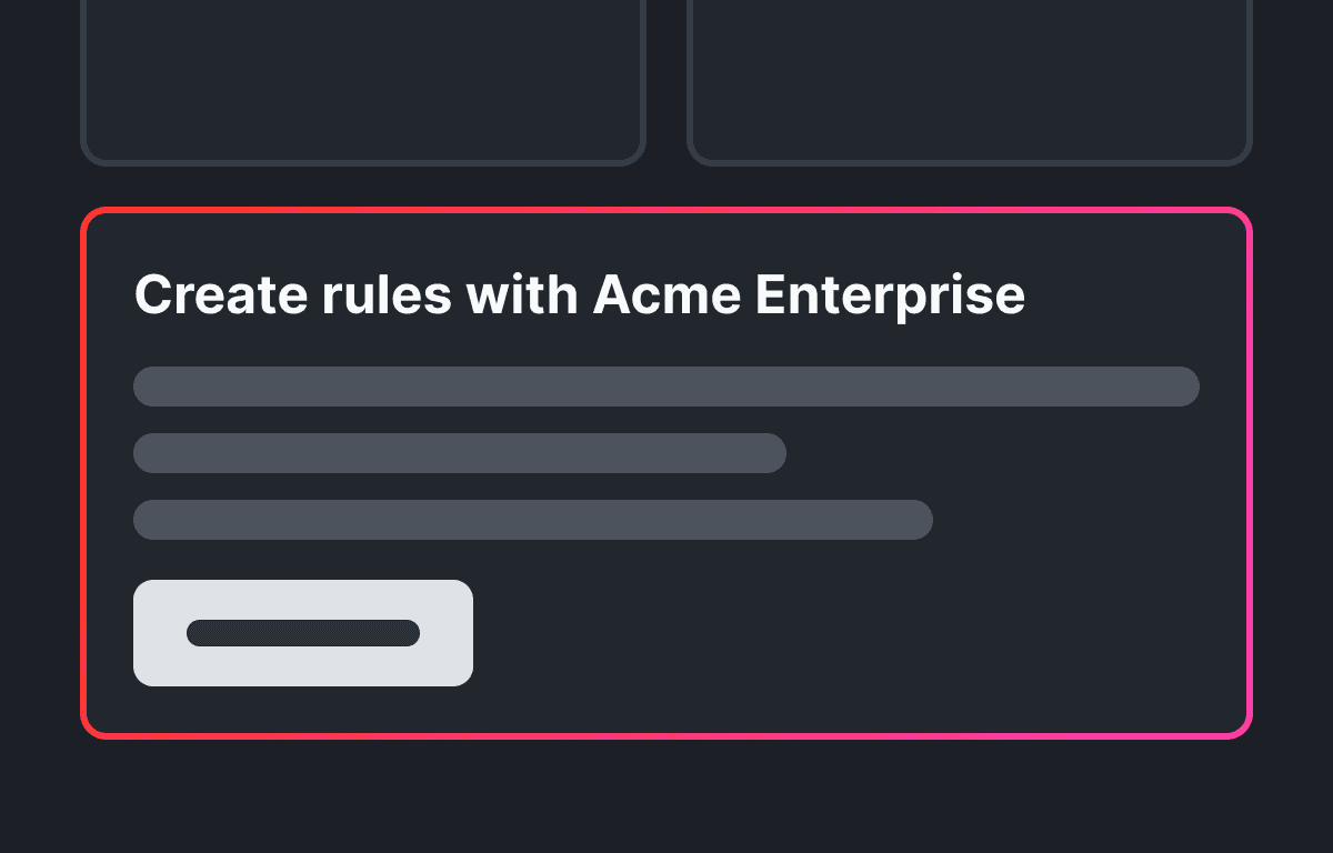
When a user enters the workflow and visits one of the application pages, the new feature badge UI element appears next to a specific element on the page, acting as a visual highlight for the new feature.
Below is a screenshot of how the workflow is set up in Flows:
Best practices
A new feature badge works best when the feature is already visible in the UI and just needs a nudge. For features that need more explanation, consider a feature announcement modal instead.
DO:
- Show the badge only to users who haven't seen the new feature yet
- Keep the label short - one to three words
- Dismiss it automatically after the user interacts with the feature
DON'T:
- Use badges for every update - save them for meaningful new functionality
- Keep the badge visible indefinitely
- Show a badge for features the user can't yet access
Getting started
- Sign up for Flows if you haven't already. You can create a free account here.
- Clone the repository from GitHub and install the required dependencies in the project directory.
- Add your organization ID in the providers.tsx file.
- Create a new component in your organization with the following configuration:
- UI component: NewFeatureBadge
- Slottable: false
- Custom properties:
- Title
- Target element
- Side: top, right, bottom, left
- Offset X: number
- Offset Y: number
- Exit nodes:
- No exit nodes needed
- Recreate the workflow in your organization and publish it.
- Run the development server with pnpm dev.
Learn more
To learn more about Flows take a look at the following resources:
Explore more examples
Build anything with Flows
Build the product adoption experiences you've always wanted.
No credit card required. Free forever.