Examples library
In-App Changelog
Add an in-app changelog to your product to inform users about new features and updates.
An in-app changelog keeps users informed about new features and product updates without pulling them away from your app. This example shows how to build a persistent changelog button in the sidebar using a custom ChangelogButton component and @flows/react - with per-entry read tracking powered by state memory, no backend required.
What is an in-app changelog?
An in-app changelog is a feed of recent product updates embedded directly in your app. It lets users discover new features, improvements, and bug fixes at their own pace - without needing to check a separate blog or email newsletter.
Common uses for an in-app changelog:
- Feature announcements - let users know about new functionality the moment they log in.
- Improvement updates - surface performance improvements or UX changes that users might otherwise miss.
- Release notes - give power users a running log of what has changed across versions.
- Re-engagement - bring back dormant users by showing them what is new since their last session.
In-app changelog best practices
A well-designed product changelog widget balances visibility with restraint:
- Persistent, not intrusive - a sidebar button lets users check updates when they want to, rather than interrupting their workflow with a modal.
- Track what users have read - an unread badge tells users something is new without forcing them to open the popover to find out.
- Keep entries short - one sentence per entry is enough. Link to a full post for users who want more detail.
- Date every entry - dates give context and signal that the product is actively maintained.
- Update without deploying - manage changelog content in your workflow tool, not in code, so non-engineers can publish updates.
How this example works
The example uses a Slottable workflow block in Flows to inject a custom ChangelogButton component into a FlowsSlot placed at the bottom of the app sidebar. The button and its entries are fully configured in Flows - no code changes are needed to add or update entries.
The changelog button
The ChangelogButton renders a button in the sidebar slot. Clicking it opens a popover listing the configured changelog entries. Each entry shows a date, a title, and links to the full changelog post. A footer link at the bottom of the popover points to the complete changelog page.
When there are unread entries, the button shows a blue badge with the unread count. Inside the popover, each unread entry has a blue dot next to its date.
Read tracking with state memory
Each entry in the entries array has an optional seen property typed as state memory. Flows persists the boolean value per user - so once an entry is marked as read, it stays read across sessions without any server-side code.
An entry is marked as read in two ways:
- Hover for 2 seconds - a timer starts on mouseEnter and is cancelled if the user moves away before 2 seconds elapse. This avoids marking entries seen when the user is just scrolling past.
- Click - clicking an entry link marks it seen immediately, since the user is actively engaging with it.
Workflow setup
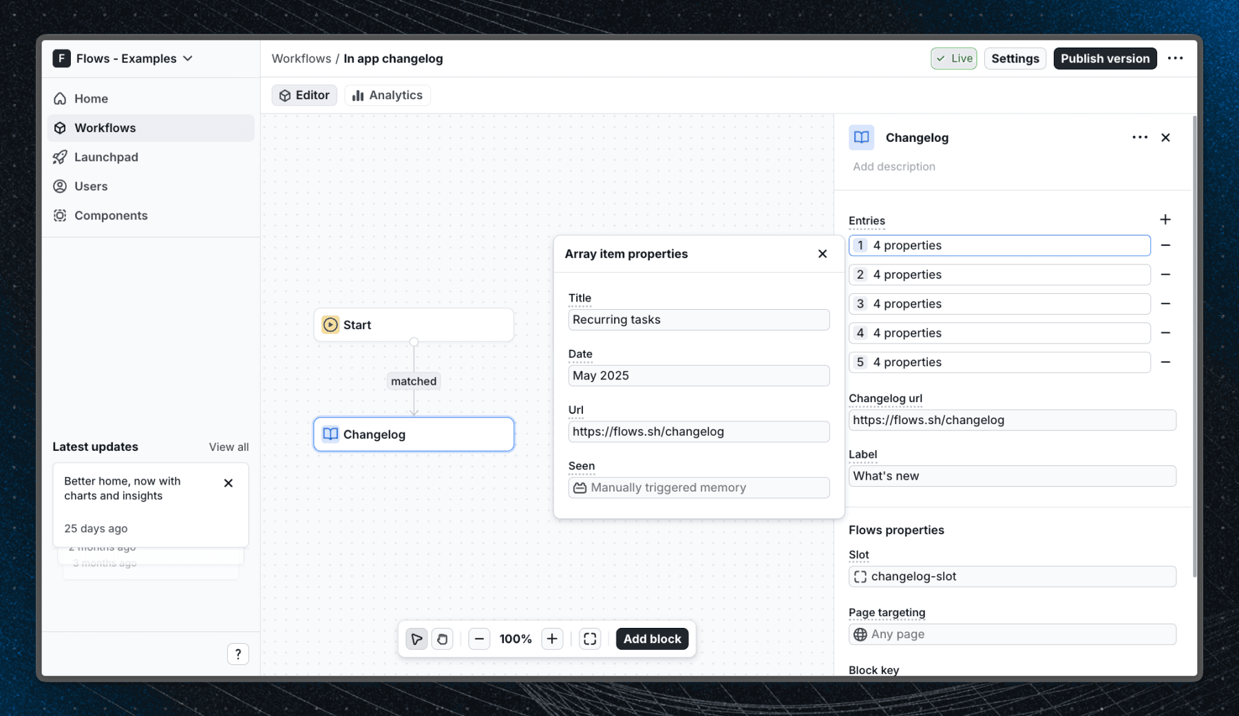
Below is a screenshot of how the workflow is set up in Flows:
Component configuration
The ChangelogButton component accepts the following props, configured in the Flows workflow editor:
- Label - optional button label (defaults to "What's new")
- Changelog Url - URL for the "View full changelog" footer link
- Entries - array of changelog entries, each with:
- Title - short description of the update
- Date - display date (e.g. "May 2025")
- Url - link to the full changelog post
- Seen - state memory property for per-user read tracking
Related examples
If you want to proactively announce a major update rather than letting users discover it themselves, consider pairing this pattern with a feature announcement or a new feature badge that points users to the changelog button on their first visit.
Getting started
- Sign up for Flows if you haven't already. You can create a free account here.
- Clone the repository from GitHub and install the required dependencies in the project directory.
- Add your organization ID in the providers.tsx file.
- Recreate the changelog workflow using the Slottable block, target the changelog-slot slot, select ChangelogButton as the component, and add your entries - each with a seen property set to State memory.
- Run the development server with pnpm dev.
Learn more
To learn more about Flows take a look at the following resources:
Framework
Next.js
Tags
Explore more examples
Build anything with Flows
Build the product adoption experiences you've always wanted.